PROJECT DETAILS
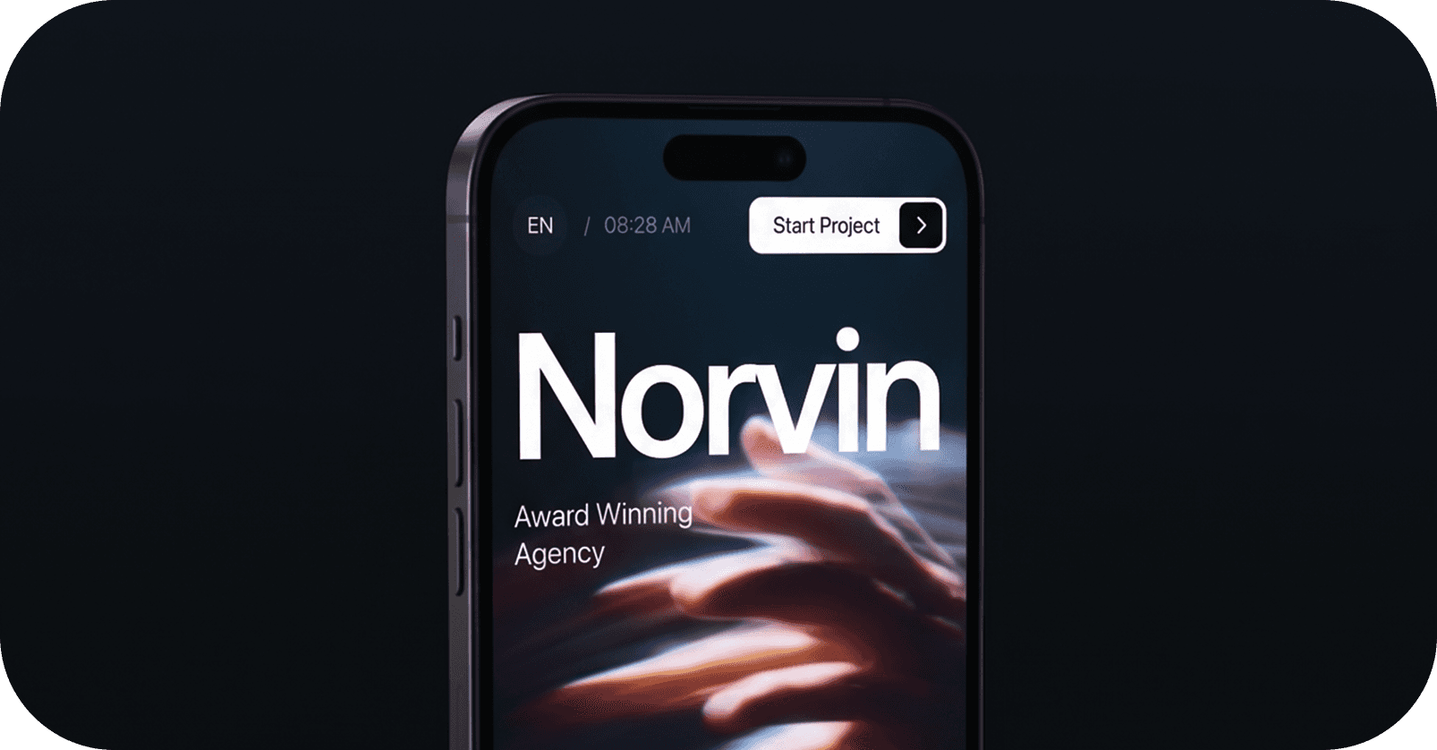
Norvin

Brand Vision & Identity
Norvin was built with a clear vision to create a brand that feels modern, refined, and purpose-driven. The foundation of the identity focuses on clarity, simplicity, and strong visual presence. Every element was carefully designed to reflect confidence and professionalism. The brand voice was shaped to feel approachable yet impactful.
A balanced color palette was chosen to maintain both versatility and recognition. Typography plays a key role in expressing the brand’s tone and structure.
UI DESIGN
UX DESIGN
INTERACTION
MVP DESIGN
DESIGN AUDIT
Creative Direction
The design process for Norvin focused on exploration, refinement, and consistency. Multiple visual direction were tested to identify the most effective approach. Mood boards and references helped define the overall creative direction. Layouts and compositions were designed to maintain balance and hierarchy.
Attention to detail ensured that every element felt intentional and aligned. Iteration played a key role in improving and polishing the design outcomes. Visual consistency was maintained across all assets and applications.
Final Outcome
The final identity of Norvin presents a strong, cohesive, and memorable brand presence. The design system is flexible, allowing it to adapt across various platforms and mediums. It enhances brand recognition through consistent visual elements. The overall look and feel communicate professionalism and modernity.
The branding creates a lasting impression while maintaining simplicity. It effectively connects with the intended audience through clarity and design. The final execution reflects both strategy and creativity working together.